GetFeedback
Text Insights: Sentiment Analysis
Sentiment Analysis helps you quickly view positive and negative feedback trends. You can analyze response sentiment by adding tiles in Workspaces or in your GetFeedback for Email dashboard.
Sentiment Analysis for Web and App Surveys
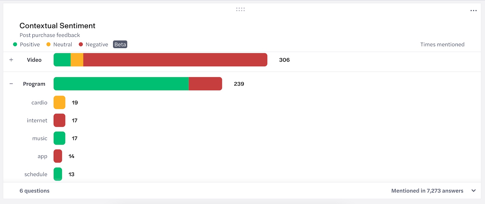
The Contextual Sentiment visualization uses SurveyMonkey’s machine learning model to identify the sentiment of keywords and phrases used in your responses, based on the context of the entire answer. This visualization shows you how often your respondents used a word or phrase in a positive, neutral, or negative way.
Viewing Subcategories
Select the + next to a word or phrase to view related categories from your responses. You can do this by keyword or phrase, or based on sentiment.
Filtering a Workspace by Sentiment
You can filter your workspace by the key words and sentiment from your Contextual Sentiment tile.
To only view responses from people who used a specific word or phrase, select the word or phrase. This filters all of the tiles in your workspace to show how key words and phrases relate to your other CX metrics and individual responses.
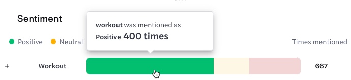
To only view responses from people who used a word or phrase in a positive, negative, or neutral way, select a bar segment next to the word. For example, to show responses from people who used “workout” in a positive way, select the green bar segment next to Workout.
The tile footer shows how many questions are represented in the visualization and how many total answers you received. To view the questions used in your tile, select the arrow in the bottom right corner of the tile.
Sentiment Analysis for Email Surveys
In your app.getfeedback.com dashboards, you can add tiles for text-based responses to learn the sentiment of keywords your respondents use. Sentiment analysis can help you find pain points for your respondents.
Using Sentiment Analysis in Email Dashboards
To get started, create a dashboard in app.getfeedback.com and add a tile for a text-based question. You can either use our text analytics tile bundle or add a single tile for the question.
You can choose from several tile designs for text-based questions to help you understand different response characteristics. If you use our text analytics bundle, we include a tile for each design.
Sentiment Gauge
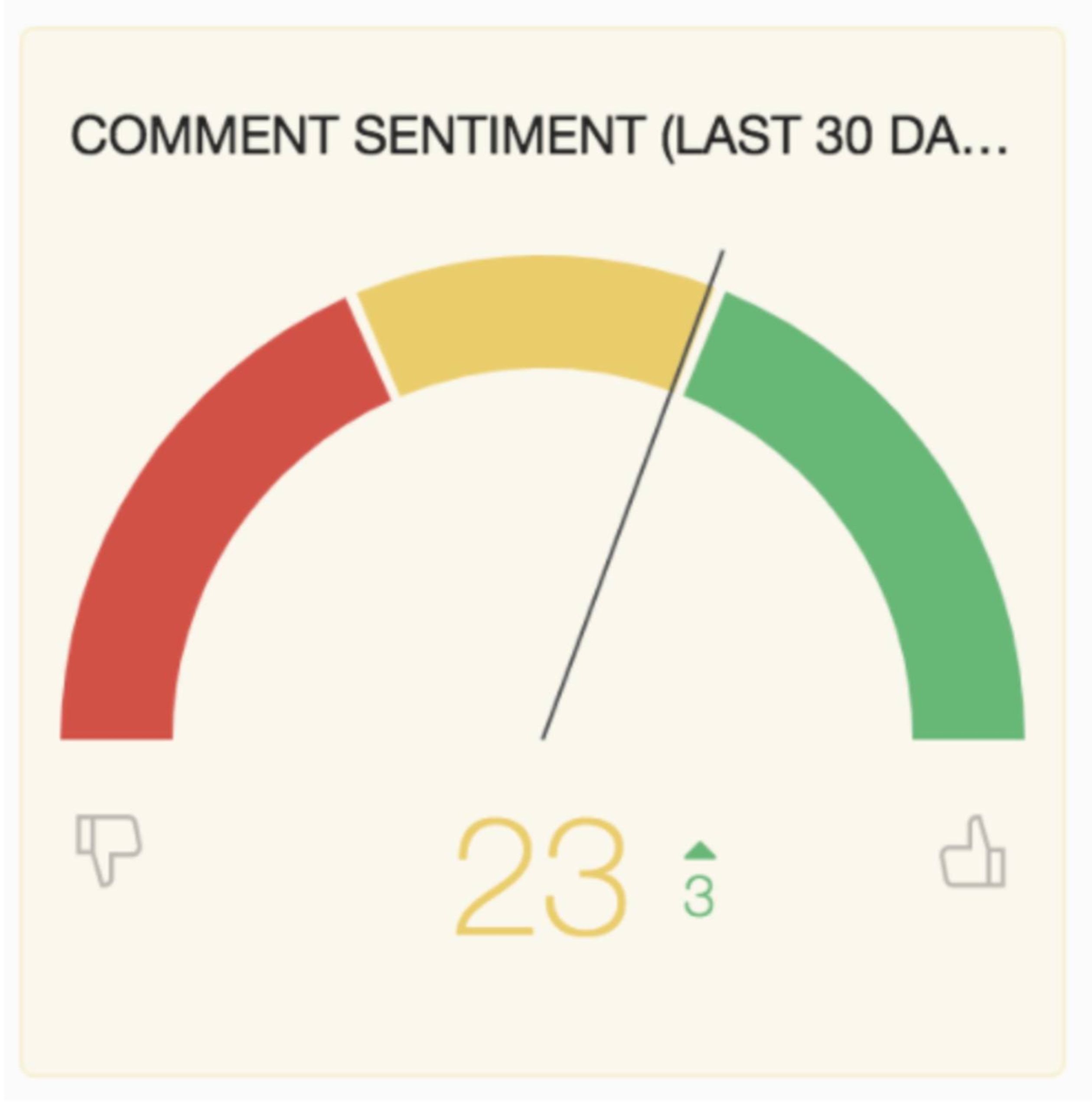
The Sentiment Gauge shows the average response sentiment on a scale of -100 to 100. Next to the average score, you can see if the score has increased or decreased since the previous period.
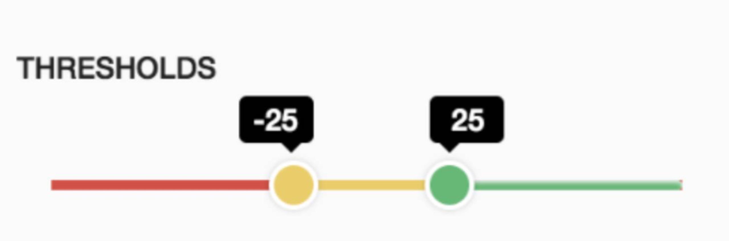
The score’s color is determined by the threshold. We'll set the threshold for you, but you can change it at any time. To change your threshold, hover over the tile, select the three dots, and then select Edit. You can then adjust the threshold and save your changes.
Comment Sentiment Trend Graph
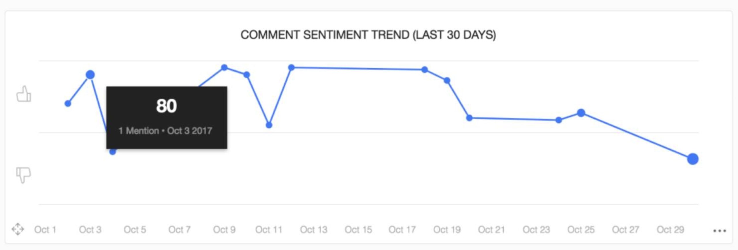
The Comment Sentiment Trend graph shows you how the average sentiment has changed over time. A higher average score means you’re getting more positive comments. Hover over a data point to view the average score for that day.
If sentiment starts dropping, you may want to look at negative key words from that timeframe to understand any issues.
Emerging Positive & Negative Keywords
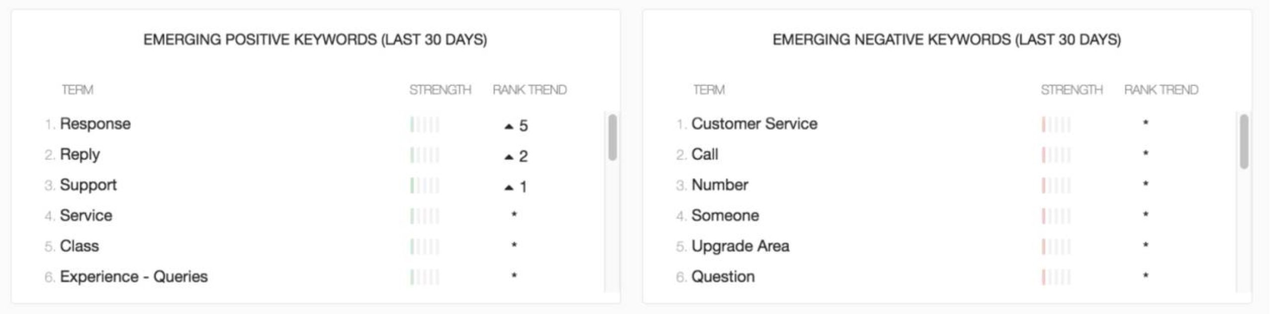
The Emerging Positive and Negative Keyword tiles show common keywords and how often they appear in responses. Keywords appear in order from most common to least common. The keyword Strength tells you how often respondents use the word in a positive or negative way. The Rank Trend next to each word shows you if the word or phrase appears more often than it did in the previous period.
To remove a keyword from the tile, hover over it and select the red x on the right side. Any keywords you remove from this tile still appear in other workspace tiles.
Comment Stream
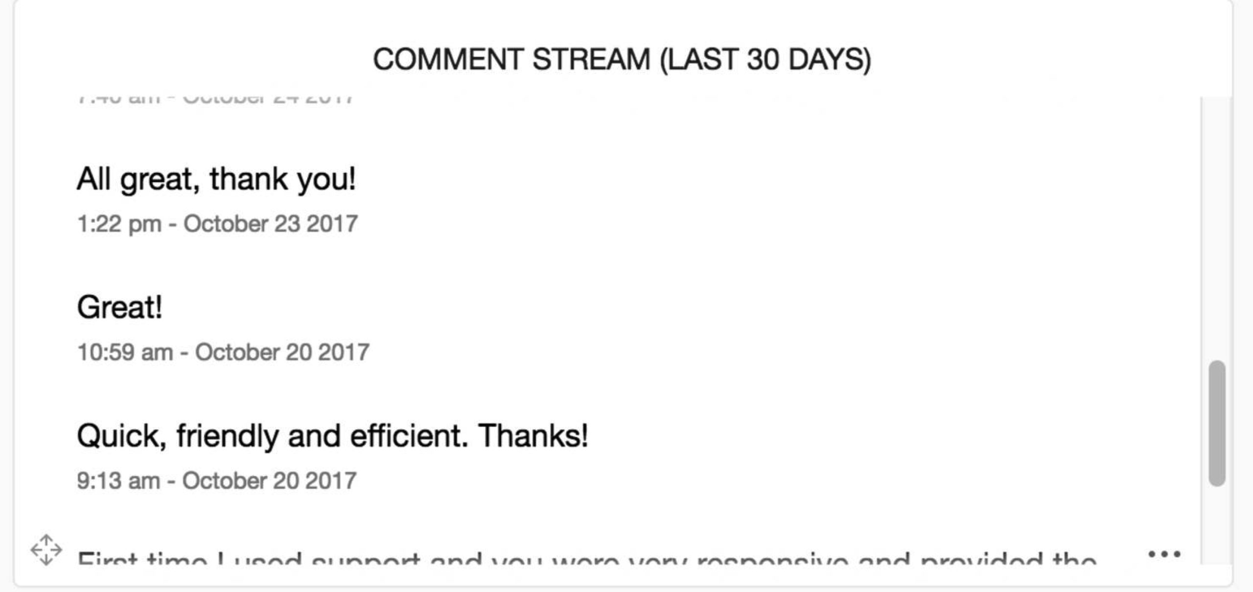
The comment stream shows all comments left on your short answer question in your survey. You can view comments from different time periods, such as the last 30, 90, or 365 days.