GetFeedback
Email Summary Reports and Dashboards
The GetFeedback Summary Report presents your app.getfeedback.com survey results in simple, clear visualizations that you can share with others. To view and filter results in greater detail, use the response dashboard.
Viewing the Summary Report
To view your summary report, go to your survey and select Results > Summary. Go through the survey to view visualizations for each question.
Each question has a simple, shareable data presentation that updates in real time. These visualizations are a great way to share findings with team members, stakeholders, or even with internal or external customers.
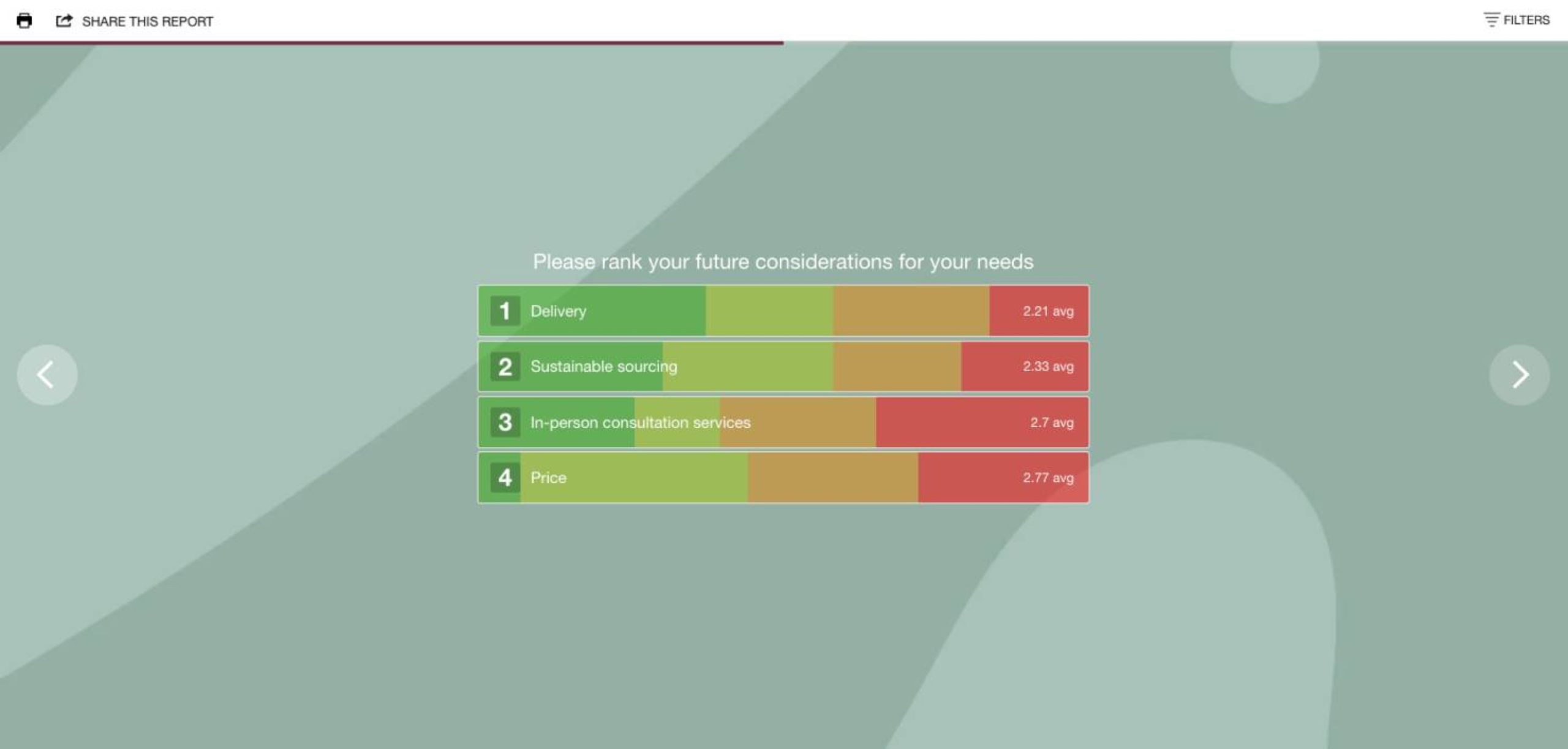
For example, a ranking question summary might look like the image below. The colors represent the percentage of total respondents who ranked each option in that place.
Sharing and Printing Your Summary Report
You can either print your report or get a link to share.
- To get a link, select Share this report to copy a link to your clipboard.
- To print your report, select the print icon in the top left corner of the report. A printable summary report opens in a new tab in your browser.
Feedback Dashboards for Email Surveys
Create personalized dashboards to view results and monitor trends from app.getfeedback.com surveys.
Video
Creating Dashboards and Adding Tiles
When creating a dashboard, you add a tile. A dashboard tile is a visual display of the results from a single survey question. A single dashboard can have several tiles that show results from one or many surveys. Compare survey responses from different surveys side by side to review key results.
To create a dashboard:
- In app.getfeedback.com, select Dashboards in the left-side menu.
- Select New Dashboard.
- Enter a dashboard name and pick a color scheme.
- Select Next to start creating your first tile.
- Select the survey to display data from.
- Select a question or survey metrics for your tile.
- Customize your tile using the options in the right panel:
- (Optional) Add a Name and Description.
- Change the chart design. Some question types have limited options.
- Choose the Date range to show responses from. We calculate the score for NPS and Ranking questions based on this date range and compare it to the previous period.
- (Optional) Filter by Merge field, Answer, or response Language.
If you filter by Merge field, you can select any merge fields you entered when creating your email. For example, if you added the respondents’ company as a merge field, you can filter by a company name.
- When you’re done customizing your tile, select Save to add it to your dashboard.
Filtering Tiles
Filter data shown in your tiles.
- In your dashboard, hover over a tile, then select the three dots.
- Select Edit.
- Under Filter By, select to filter by Merge field, Answer, or response Language.
- Merge field: Select any merge field you tracked in the survey, select the condition, then enter the value to filter by. For example, if you want to leave out any responses from a plan level, set the filter to “Plan level” “is not equal to” “Premium.”
- Answer: An answer to a specific survey question.
- Language: The respondent’s language.
- Select Save to view the filtered tile.
Adding, Editing, and Copying Tiles
Once you create your dashboard, you can add new tiles or edit existing ones at any time.
- To add a new tile, select New Tile in the top right corner of your dashboard.
- To edit a tile, hover over the tile, select the three dots, then select Edit.
- To copy a tile, hover over the tile, select the three dots, then select Copy. A copy of the tile appears in your dashboard.