GetFeedback
Survey Theme: Mobile app
Customize your app feedback forms and campaigns to match the look and feel of your app. Theme changes will be reflected in your app immediately without releasing a new version.
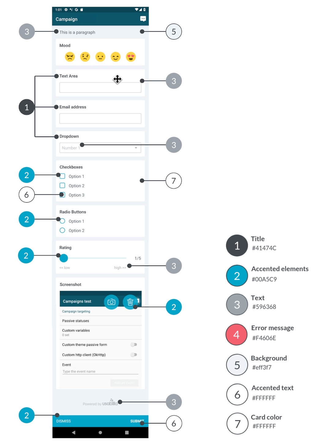
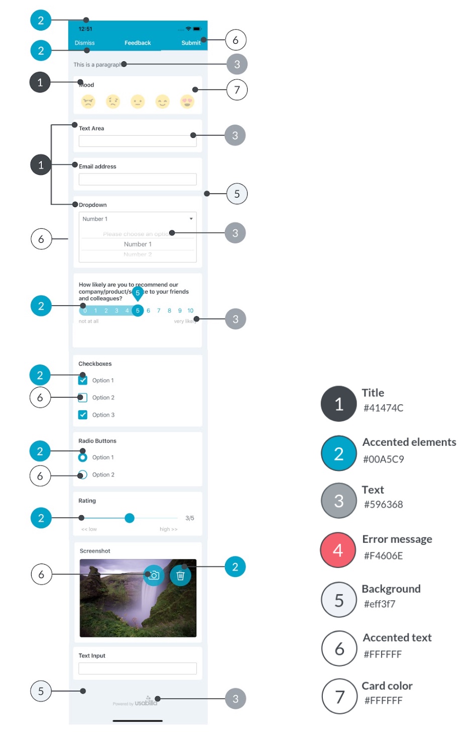
Color Groups
To help you identify the different elements that can be used in GetFeedback Digital for Apps Feedback Forms and Campaigns, we've divided them into groups based on their role in the interface. Below you'll find an overview of these color groups for Android and for iOS.
- Group 1, Title color: Changes the color of all question titles and headers.
- Group 2, Accent color: The color of interactive or otherwise important components like sliders, checkboxes and the submit button. This also includes the navigation bar of the feedback form.
- Group 3, Text color: The color of general text, such as user input, paragraphs, checkbox options etc.
- Group 4, Validation message color: The color that highlights fields which are either required and left blank or incorrectly filled.
- Group 5, Background color: The color of the background.
- Group 6, Text color on accent color elements: The color of the text displayed over elements in accent color, such as selected buttons and checkmarks in checkboxes.
- Group 7, Card color: The color of the card design elements.
The following images display examples of how the elements are grouped for Android and for iOS.
Android Color Groups
iOS Color Groups
Customizing Color Settings
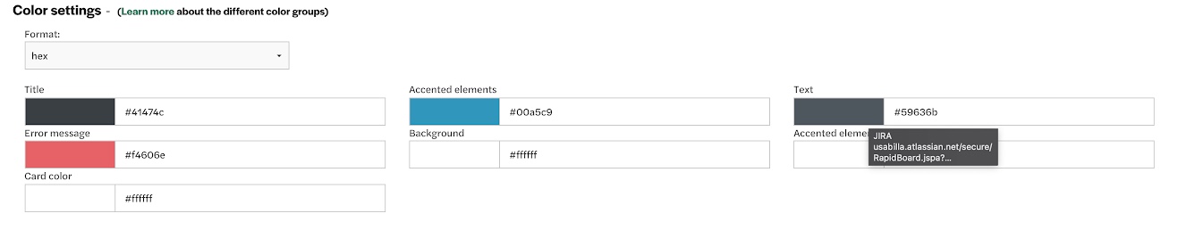
To customize your form's color settings:
- In the form editor, select Advanced.
- Scroll to the Color Settings section and customize the colors.
- (Optional) To use RGB instead of hex values, select RGB from the dropdown.
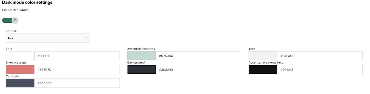
Using Dark Mode Color Settings
You can customize a separate set of colors for your form when dark mode is enabled. This way, you don't have to create a separate form for dark mode specifically.
To customize colors for dark mode:
- Below the Color settings section, toggle on the option to Enable Dark Mode.
- Customize the form colors.
- To use RGB instead of hex values, select RGB from the dropdown.
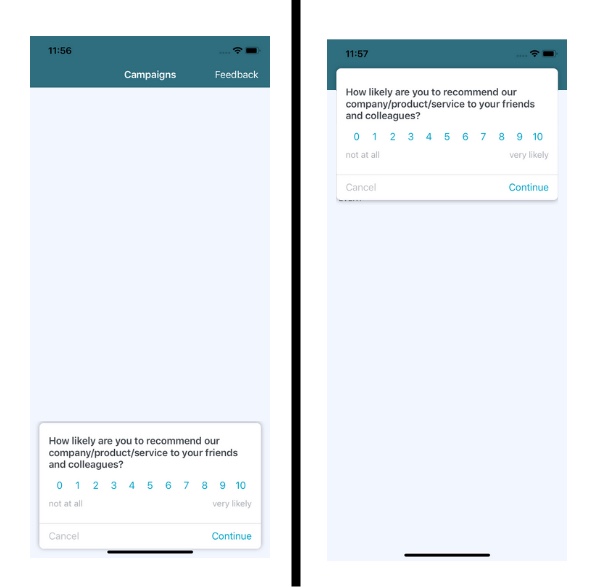
Changing the Campaign Banner Position
Campaigns display as a banner in your app. When editing a campaign form, you can set the banner to show at the bottom or top of the screen. By default, the banner displays at the bottom of the screen.
To change the campaign banner position:
- From the campaign form editor, select Advanced.
- Under General, select a banner position.
The images below show a campaign banner at the top and bottom of an app screen.