GetFeedback
App Feedback Dashboard
GetFeedback gives you multiple ways to view and analyze your app feedback. Use the dashboard to get an overview of your users and their feedback. Use the Feedback page to dive deeper into app feedback.
Before You Start
Make sure you’re in the Apps section of GetFeedback.
- In app.usabilla.com, go to the top left corner below the GetFeedback logo.
- If you see Websites or Email, select the dropdown, then select Apps.
Viewing Feedback Overview in the Dashboard
The App feedback dashboard gives you a high-level overview of the feedback coming in through your application.
To view your dashboard, select Dashboard from the left-side menu.
Filter options
Select Filter by in the top right corner to filter your feedback by:
- Date: Data range of the feedback. By default, the dashboard shows the last 30 days.
- Form: the feedback form the respondent used to provide feedback.
- Platform: Android or iOS.
- App: the app version used when feedback was given.
General Graphs
The 3 overview graphs provide a quick overview of app performance. These graphs represent the average emotional score, feedback item frequency, and NPS score (if you’re collecting NPS).
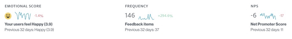
Emotional Trendline
The Emotional Trendline shows a timeline of the average mood rating. Hover over the data points to see a breakdown per day.

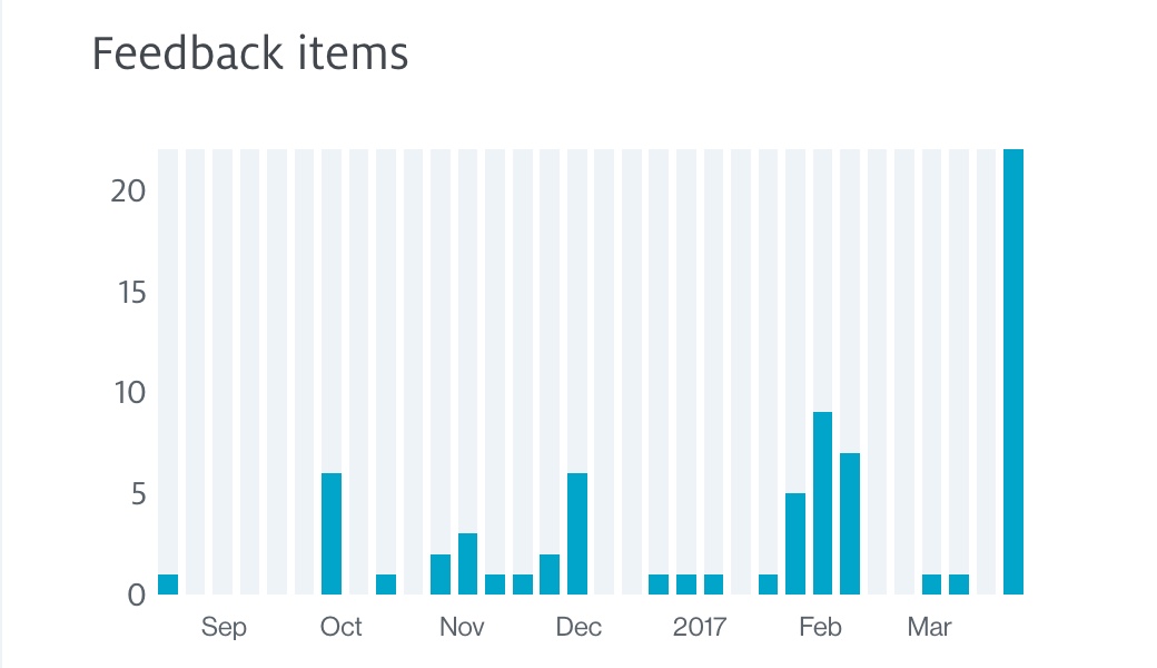
Feedback Items
The Feedback items graph shows you the number of incoming items per day over the date range you specified. Hover over the individual days to see the number of feedback items submitted on that day.
If your selected date range is longer than 30 days, the graph shows feedback items by week.
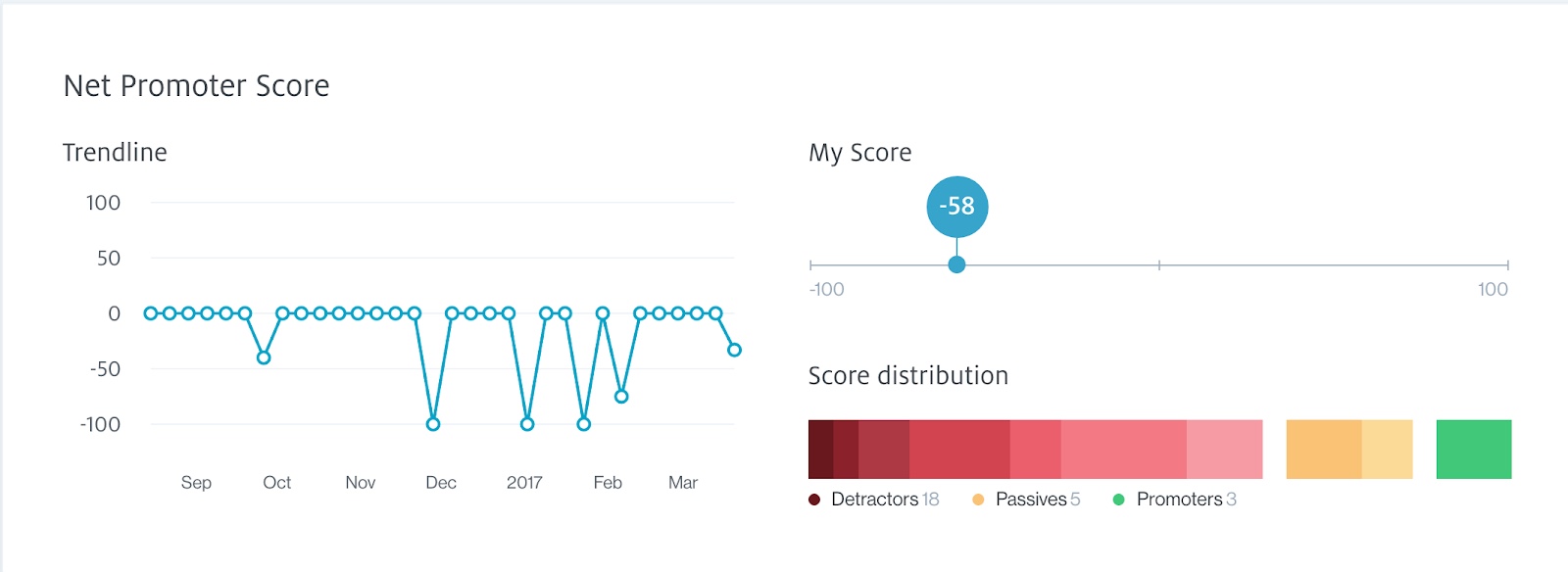
Net Promotor Score
If at least one of your forms contains a Net Promoter Score (NPS) question, you also have an NPS Trendline and score breakdown chart.
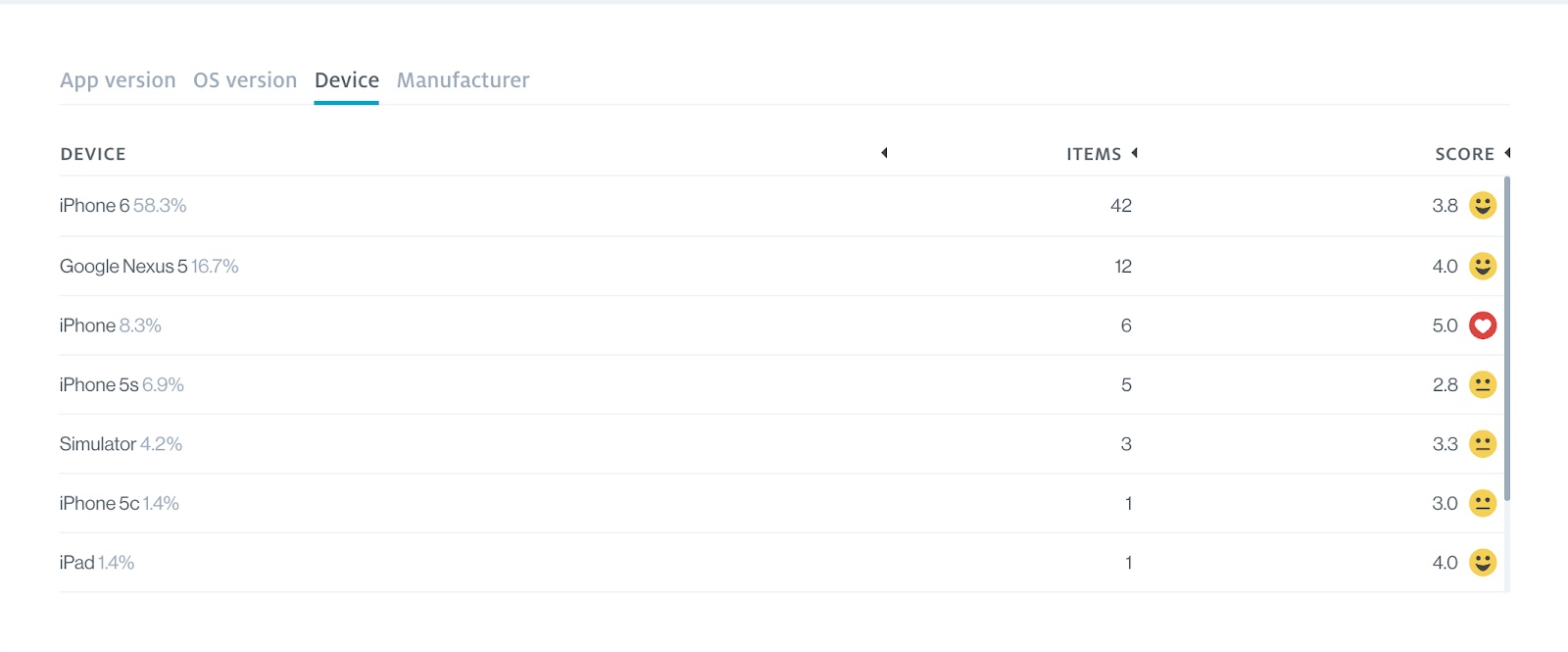
Technical Metadata
The next chart shows information about the devices that respondents sent feedback from. This information is collected whenever a user submits feedback through the feedback form in your app. You will find the average mood score for each of the available specifications as well as the number of feedback items that have been submitted. This breakdown helps you see if users are having more problems on specific devices or operating systems.
The metadata chart lets you view:
- App version (this is specified by your developers in the implementation of GetFeedback Digital for Apps)
- OS version (for example, iOS 14.5)
- Device (for example, iPhone or iPad)
- Manufacturer (for example, Samsung or Apple)
Device Language
The device language is the language set in the respondent’s device specifications. This chart also shows the number of items sent and the average mood score for each language.

Label
You can add labels on the feedback page to group your feedback, mark the item’s status, or assign the item to a specific team member. The dashboard chart shows you the labels used on your feedback items and their average mood score.
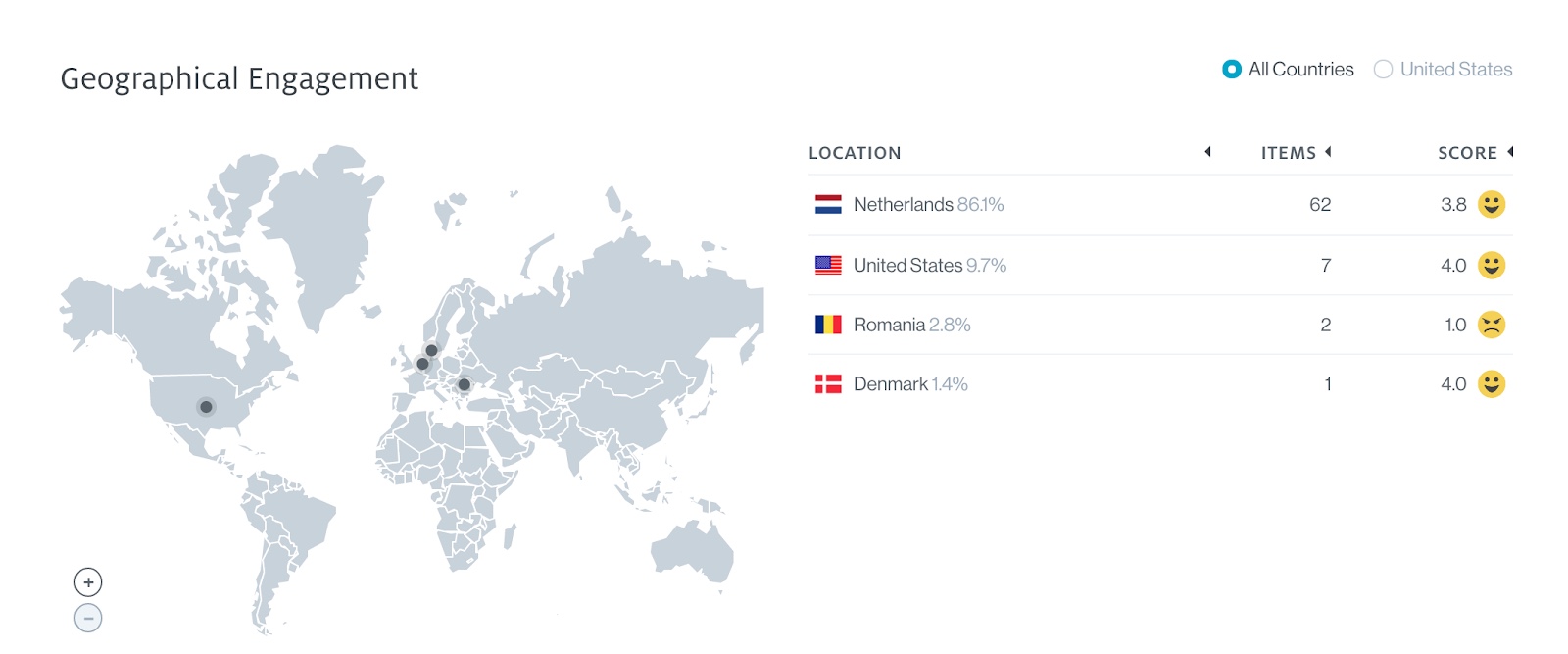
Geographical Engagement
The geographical engagement tile tells you where your users left feedback. The location is based on the user's IP address and segmented per country.
If your users left feedback in the United States, you can also view feedback per state.
View Detailed Feedback
When you start collecting feedback through your app, you can view and analyze responses on the Feedback page in real time. You can filter your feedback to look at specific scores, labels, device types, and more.
Access the Feedback page
To view feedback in real time, select Feedback from the left-side menu.
Filtering Panel
Use the filtering panel on the left side of the screen to view feedback by score, date, device type, and more. You can filter feedback by:
- Forms: The feedback form respondents submitted
- Date: Date or range when respondents gave feedback
- Status: Status of the feedback, either new, read, archived, or starred
- Mood: The mood rating given
- NPS: The NPS score given (if available)
- Labels: The labels assigned to feedback
- Device: The device that respondents sent feedback from
- Os Version: The operating system that the respondent used to send feedback
- App version: The app version that respondents sent feedback from
When you apply a filter, you can bookmark the URL to visit the filtered view later, or you can copy it to share with colleagues.
Trendline charts
At the top of the screen, the trendline charts give you an overview of the feedback you received. The charts shown depend on the data you’ve collected.
- Emotional trendline: Average mood rating results over time
- Frequency trendline: Number of feedback items received per day
- NPS: Breakdown of your average NPS
- Device chart: Percentage of feedback items per device
- Operating System Chart: Percentage of feedback items per OS
By default, the charts show results for the last 30 days. You can use the filtering panel to change the date range.
Feedback Items
Submitted feedback items display at the bottom of the page.. Select an item to view feedback details. Learn more about viewing and managing feedback
Exporting Feedback Items
Select Export in the top right corner to download a .csv file of your feedback. You can use this export to analyze and share raw data.